The script's character shifts with varying pen strokes, adapting to different writing tools and techniques. It can serve as an alternative teaching template.
Fostering Increased Appreciation for Handwriting, Penmanship, and a Personal Handwriting Style
By conducting a comprehensive historical study, my dissertation aimed to analyse school penmanship and handwriting templates, primarily relying on the paleographic and typographic literature. It investigates paleography and typography to reassess their foundations, and it attempts to verify the letterforms as a reflection of period and contemporary habits in penmanship. In artistic terms, the dissertation aims to apply these findings in the creation of a new script. The study underlines the characteristics that define a well-designed, easy-to-write handwritten script and presents the conclusions of studies on the basis of which such scripts can be created. The result is a cultivating typeface that aims to become a template for fostering personal handwriting styles, with an intersecting impact on personal calligraphy, letter design, and sign writing.
Specification
Full title of Doctoral Thesis – PhD Project
Fostering Increased Appreciation for Handwriting, Penmanship, and a Personal Handwriting Style
Academy
Studio
Doctoral Thesis Supervisor
doc. ak. mal. Karel Haloun
Doctoral Thesis Consultant
Mgr. Pavla Pauknerová, Ph.D.
Opponents
Prof. Jan Solpera; doc. PhDr. Ivana Ebelová, CSc.
Consultants
PhDr. Hana Pátková, Ph.D.; doc. MgA. Tomáš Brousil
Doctoral Thesis Defense
Prague, 2020
Few aspects from my research


Yes, we absolutely need handwriting today! There are countless reasons why (see my full PhD thesis below), but we must adapt it to meet contemporary and future needs. Handwriting should serve us, yet its current state is alarming. Few people are truly satisfied with their handwriting, which leads to its decline. Both children and adults not only need but genuinely want guidance on how to improve it!
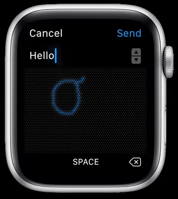
Take this example: with Apple’s Scribble software, you can handwrite directly into a search engine or use handwriting on your tablet or watch. Neural networks recognize characters regardless of skill level, making it much faster and easier than typing on a keyboard. Yet, hardly anyone takes advantage of this feature.
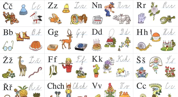
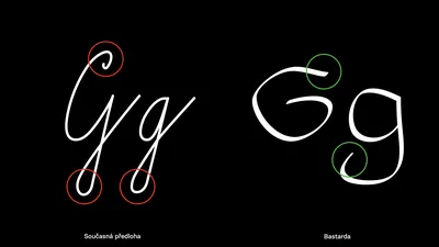
School writing templates play a crucial role in shaping handwriting skills and spreading writing knowledge. They should define basic aesthetic principles and instill fundamental techniques. Yet, only a few countries have updated their cursive models. In Czechia, first-graders are still learning a script that is over 90 years old—archaic, overly complex, and poorly suited for modern use. It is still accompanied by Times New Roman, the same illustrations from the 1990s, and, most importantly, the same outdated teaching methodology.
A major reform, introduced by Ministerial Decree on December 7, 1932, established a new writing model with freer morphology. However, its artistic foundation remained rooted in the precise English Latin script.
Over time, the school script underwent a series of modifications, gradually evolving into its current form. The most significant change came in the 1970s from doc. Václav Penc, whose redesign was overly rigid and mechanical. Professor Jan Solpera criticized it, warning that its adoption would result in „even more illegible handwriting than we see today.“
Despite this, the script remained virtually unchanged in exam papers, as it met the approval of the authorities at the time. With digitalization, its flaws have only become more apparent. Today, our school script is hopelessly outdated and fundamentally flawed.
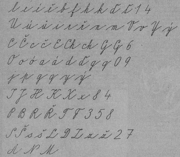
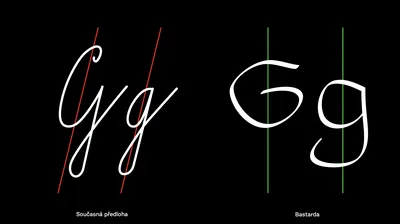
Given these issues, it’s clear that a new harmonized template is needed—one that can improve handwriting for anyone uncertain about their handwriting. There are two possible approaches: a careful typographic redesign of the existing school template or a more comprehensive solution. The first approach falls short—proof? Before developing my final script typeface, I designed this version above, only to end up with a dull, overly delicate script that I refused.
The second approach was more challenging—it required drawing a new writing skeleton from scratch, based on the proper historical model.
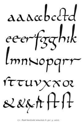
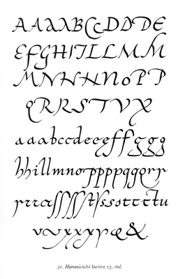
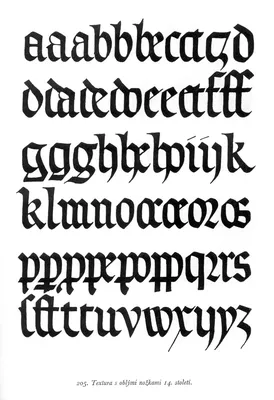
By the 9th century, script development culminated in the emergence of the Carolingian minuscule, which improved legibility by separating individual letters. It likely reached our territory in the 10th century, forming the foundation for Gothic script. The precise chiseling of Gothic book minuscule led to Textura—a meticulously drawn script. In the early 14th century, Bastarda emerged as a practical alternative for rewriting literature in national languages. Meanwhile, abroad, the Renaissance lettera cancelleresca—an exceptionally refined humanist cursive—superseded Gothic scripts. Its elegance and functionality make it a timeless model, still relevant today.
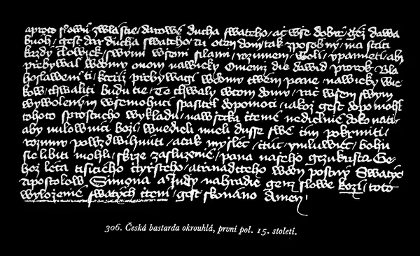
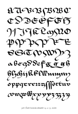
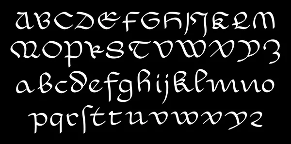
While others based their design on Cancellaresca, my research suggests that Bastarda (below) could be a more suitable local and formal foundation. Bastarda script emerged in the early 14th century for transcribing literature in national languages. By separating letters and using a broad letterform, it achieved optimal readability. It quickly spread across our region, gaining both popularity and a distinct national character during its peak development – and maintained a stable form in our region for over 300 years, thus became deeply ingrained in our writing tradition.
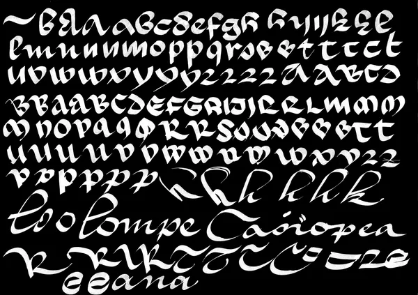
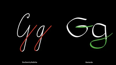
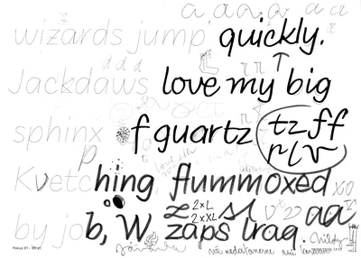
So I tried to test the limits of Bastarda with some messy sketches. The key thing is that Bastarda is limited by three-letter ligatures and achieves better readability when individual letterforms are preserved. Most characters are formed in just one or two strokes, without requiring a guiding stroke for the next. By extending exit strokes a continuous script effect can be created—though this remains purely an illusion. The characters appear visually connected, yet subtle breaks persist between them.
Even digital modifications of bastarda proved that the script would need to be significantly modified. Second, it does not have to become a fixed basis for the cursive handout; it is enough that it was able to indicate an ideal solution to all the problems we face with our current model, like this:
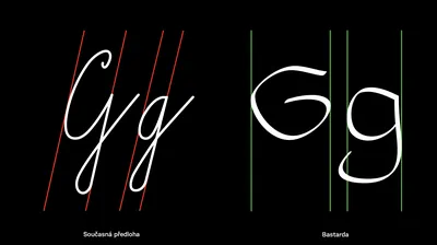
- in contrast to excessive mechanical narrowing, it has expanded proportions, almost to a square
- in contrast to the unnatural slant, it is straight, which is easier to write, especially for left-handed people, and can be easily tilted to both sides
- it also does not contain too many mechanical connections, but allows for the development of a number of individual connections
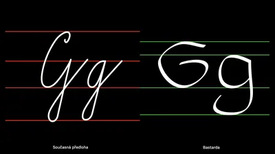
- bastarda has a higher x-height and shorter ascenders + descenders, increasing the readability and compactness of the letter shape
- bastarda has a simple shapes, which is more related to contemporary fonts for print (and it matches fonts in textbooks)
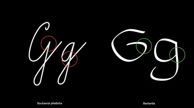
- instead of dark complicated areas, it has a lot of light internal space and an optimal ductus evoking a feeling of solidity
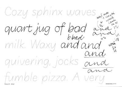
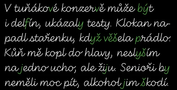
The final script letterforms were preceded by numerous sketches and drafts. I rejected versions based purely on connected letters, where the connections were often linked by „loops“. The resulting simplified script font allows an experienced teacher (or methodologist) to introduce or omit connections according to the individual writer’s preference.
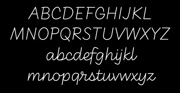
The result – a new linear cursive
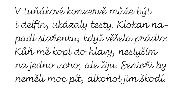
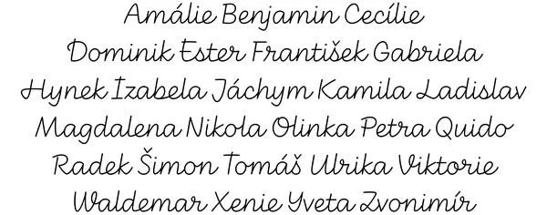
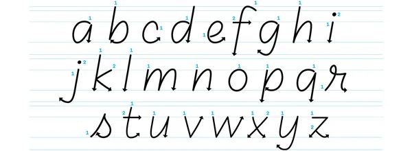
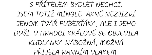
Basic handwritten minuscules with mostly connected characters
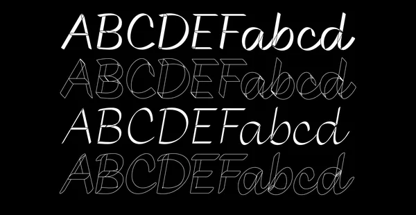
Its proportions and morphology are rooted in bastarda, but unlike bastarda, it features connections and a slight slant. Wide proportions and a high x-height lighten the ductus, while shortened descenders and optional tails and swashes add flexibility. To accommodate Czech’s long words and diacritics, certain letters break on the right, allowing for natural pauses and smoother hand movement. Minuscules can be written either connected or unconnected. Basic shapes require only one, at most two, strokes. Arrows indicate the correct start and end of each stroke.
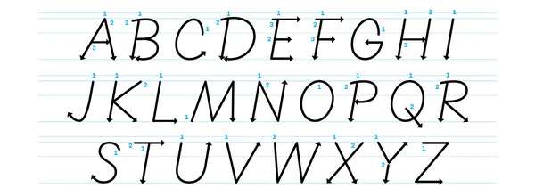
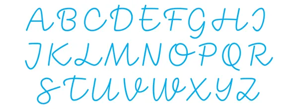
Basic handwritten majuscules
Majuscules feature open forms and wide proportions. Round strokes start with an upper serif, enhancing writing speed. Strokes can flow freely—sharp, wavy, or straight—offering various stylistic adjustments.
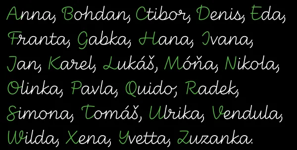
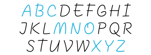
Connected handwritten majuscules
The majuscule set with connecting strokes to minuscules functions as initials. Loops and swashes enhance writing speed, while some letters remain clearer without connections. The choice to join individual letters is left to the writer.
Freely written majuscules
The unconnected majuscules are designed exclusively for uppercase writing, with sharp angles replaced by smooth, naturally flowing strokes.
The resulting script can be tried out, adopted, commented on, and modified. I plan to test the typeface with children, tutors, methodologists, and calligraphers to explore its limits, refine design and technical flaws, and release it as soon as possible.
DOCTOR THESIS (Czech language only)
Dizertace_web
Or you can play the talk about my PhD in English from TypeParis 2022!
