Sólista Espresso Bar
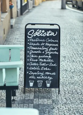
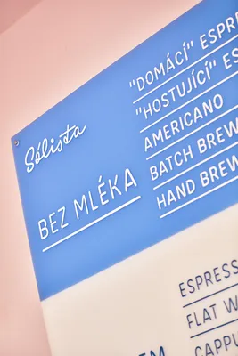
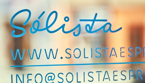
Sólista was one of the first coffee shops to entrust me with its visual identity after I began my sign painting practice. As a brand-new establishment, it required a comprehensive retail design—from the logo and menu boards to the coffee cups!
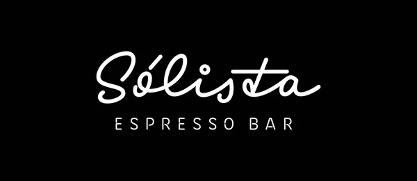
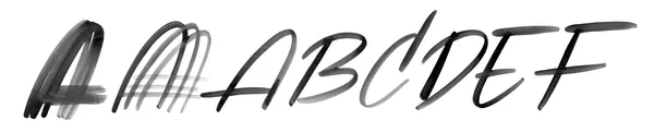
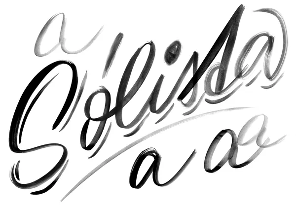
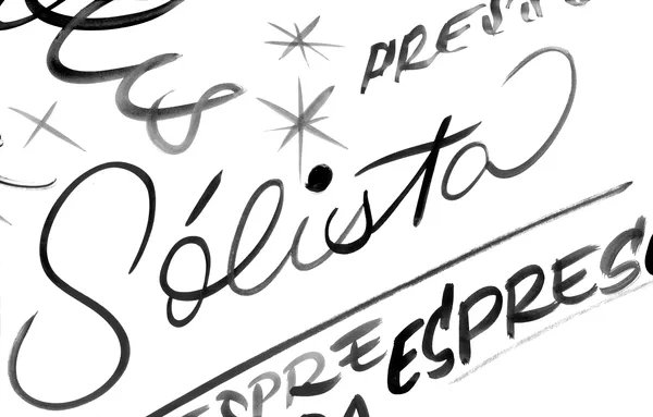
While the initial brush sketches were vibrant and full of sign-painting charm, they didn’t quite match Sólista’s character. Through the sketching process, I explored various creative directions, ultimately arriving at a simple monolinear vector lettering with a distinctive feature: a broken cross on the t inspired by how us, Czechs, often write it. The final lettering was complemented by Motel (Superior Type), an inline typeface that also works seamlessly as a stencil.
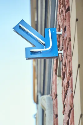
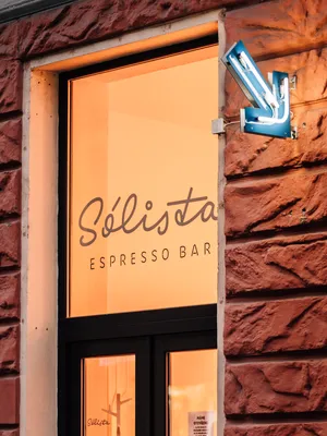
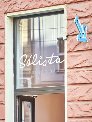
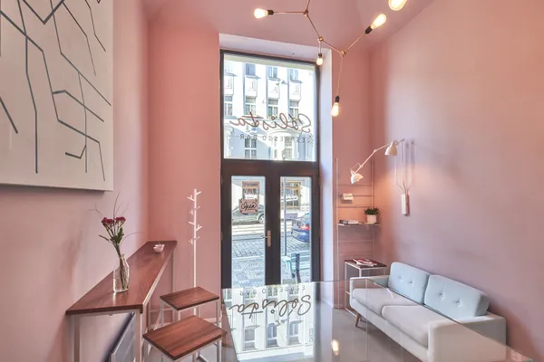
I hand-painted the lettering on all visible spots, including the window storefront, menu boards, and additional signage for the coffee offerings. An arrow from the Motel typeface points the way to the café, inviting passersby from the busy street.