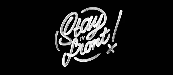
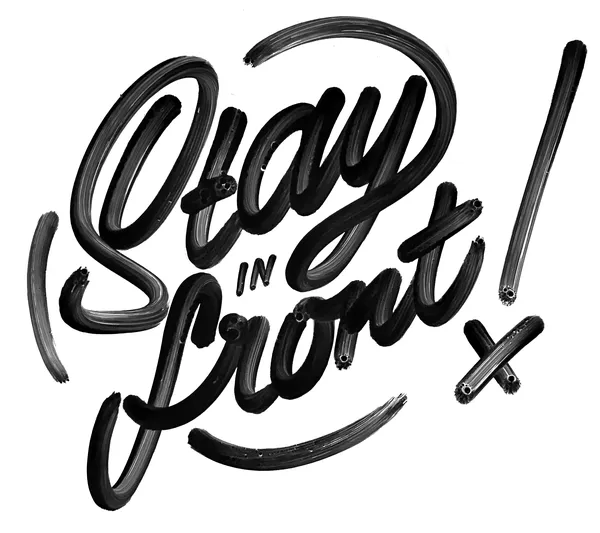
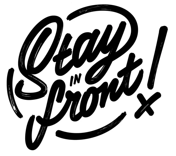
Stay in front!

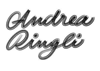
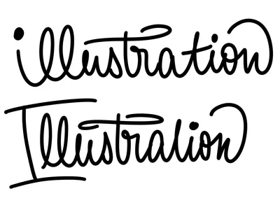
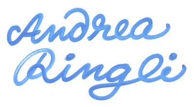
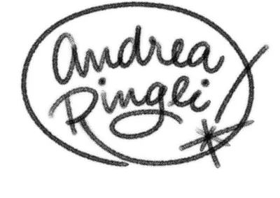
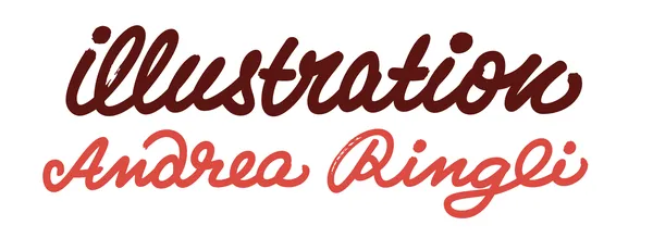
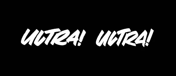
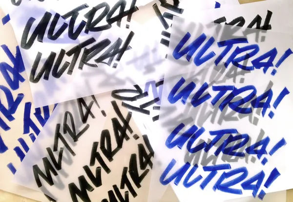
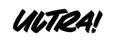
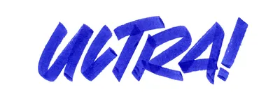
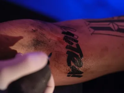
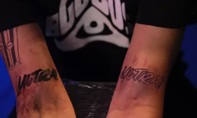
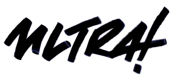
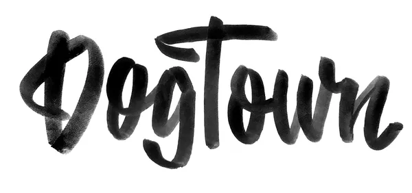
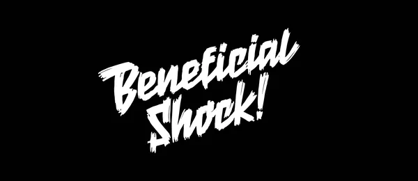
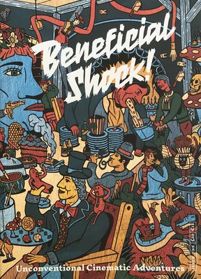
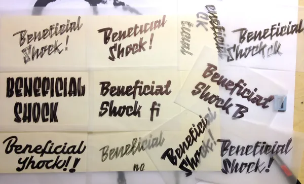
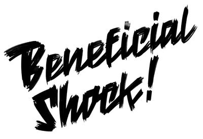
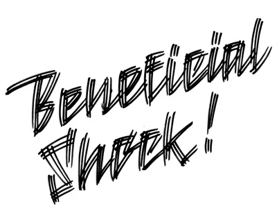
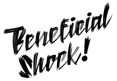
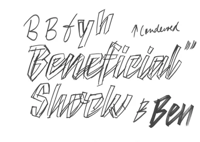
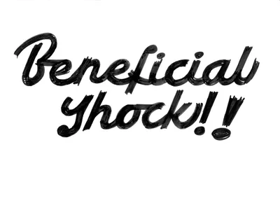
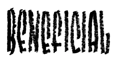
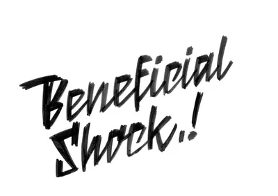
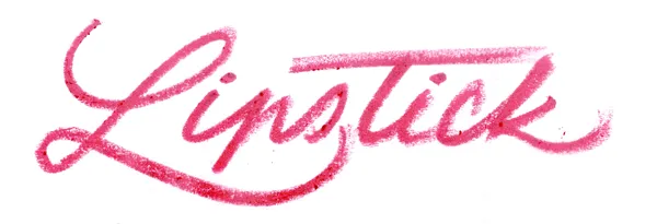
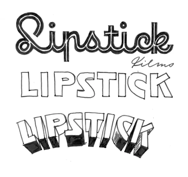
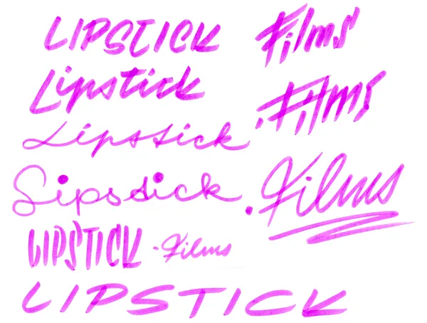
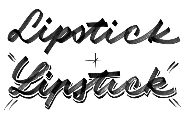
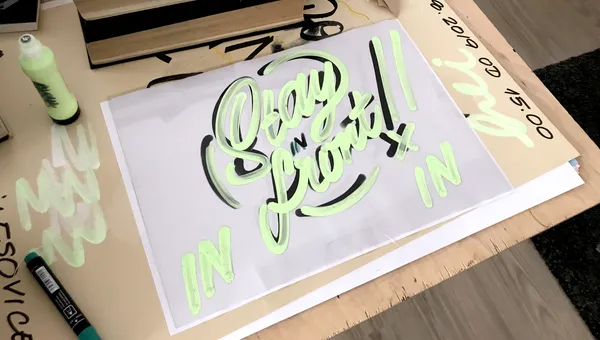
Sometimes, I create quick lettering pieces for various occasions, using them as opportunities to explore new forms and handwritten expressions. It’s like a mini training session—experimenting with tools, techniques, and styles, often stepping outside my comfort zone. This particular piece was designed as a print for a canvas goodie bag at a conference in Zurich, Switzerland. Featuring watery chalk paint, the lettering boasts a semi-scratchy texture and a playful comic-like character, enhanced by a bubble swash stroke encircling all the letters.

Specification

  • Full Name

    Stay in front!

  • Client
  • Lettering

    Petra Dočekalová

  • Tools

    Molotow squeezer marker with chalk paint

  • Designed, released

    2019

  • Lettering for Andrea Ringli

    Working with Swiss illustrator Andrea Ringli on her lettering logotype was a delightful experience. To capture the essence of her unique style, I explored various lettering approaches – experimented with both digital ProCreate pens and traditional analogue tools to find the perfect match.

    I wanted to incorporate the playful and almost childlike character of Andrea's illustrations in a form of oblique letterforms and curly strokes into my designs. Ultimately, a simple monolinear stroke with quick bottom connections and visible dots emerged as the winning concept.

    Specification

  • Full Name

    Andrea Ringli Illustration

  • Client
  • Lettering

    Petra Dočekalová

  • Tools

    Chalk-based squeezer markers, ProCreate digital brushes

  • Designed, released

    2022

  • Ultra Ultra

    Lettering (and tattoo) for the new album by Czech rapper Vladimir 518. The lettering was designed to feel sharp, bold, dominant, and uncompromising, with tightly interlocked letters that minimize spacing. Two slightly different versions—one for each arm—were developed through extensive sketching, where I emphasised maximum marker pressure and dynamic, rapid strokes. The final lettering was tattooed on Vladimir’s arm just in time for filming the music video for his album ULTRA ULTRA.

    Specification

  • Full Name

    Ultra Ultra

  • Client
  • Lettering

    Petra Dočekalová

  • Tools

    Alcohol based chisel markers

  • Designed, released

    2017

  • DogTown

    The DogTown boutique specializes in the sale, production, and distribution of a wide range of dog supplies. The aim was to create a simple lettering wordmark that harmonizes with the distinctive illustrations by Kateřina Boudriot Bažantová, which define the boutique’s identity—from a Chihuahua on shop’s awning to a bulldog on a label of pâté. The final vector lettering integrates effortlessly into the shop’s interior and counter design while perfectly complementing the vector illustrations on smaller products, such as dog food cans.

    Specification

  • Full Name

    DogTown

  • Client

    DogTown Letenské náměstí 156/1, 170 00 Prague 7

  • Lettering

    Petra Dočekalová

  • Tools

    Brush water-based marker

  • Designed, released

    2019

  • Beneficial Shock!

    Beneficial Shock! is a film magazine for movie lovers and illustration enthusiasts that champions progressive thinking from contemporary image-makers alongside written content by respected film journalists/critics. The logotype mimic the cinematic typography from 1950s, such as noir cinema movie titles. I experimented with various script styles, tilting them on a steep incline and enhancing the design with dramatic drop shadows and intentionally scratchy details to amplify the bold, noir-inspired character.

    Specification

  • Full Name

    Beneficial Shock!

  • Client
  • Lettering

    Petra Dočekalová

  • Tools

    Ink pen, pencil, tracing paper, chalk markers

  • Designed, released

    2016–2017

  • Lipstick


    Lipstick is a young Czech production company driven by a passion for film and branded entertainment. At first, I envisioned lettering that leaned heavily into a cinematic aesthetic—experimenting with drop shadows, curved text, Art Deco inlines, and typography mimicking classic movie titles. Naturally, I couldn’t resist trying a version written with an actual lipstick!

    However, the brief called for something understated yet confident, with a bold and distinctive “L” as the focal point. The result needed to avoid girly flourishes while still exuding a feminine, precise elegance in script form. The final design is a clean, flowing lettering style without unnecessary embellishments, featuring one subtle nod to Czech handwriting: a lowercase “p” in the distinctly Czech style.

    Specification

  • Full Name

    Lipstick

  • Client
  • Lettering

    Petra Dočekalová

  • Tools

    Real lipstick, various alcohol-based markers

  • Designed, released

    2019

  • We value your privacy

    This website uses cookies and other technologies to collect data such as your IP address, device data and browsing data which are necessary to proper website functioning or with your consent to analyse the traffic and improve our services. You can adjust or withdraw your consent at any time by visiting Cookie settings. To learn more, please visit our Cookie policy.