Popname
Popname is a Czech skate & sneakers store. They’ve created a special edition of merchandise for it’s 15th birthday & brand new sub-label comes with it in my style.
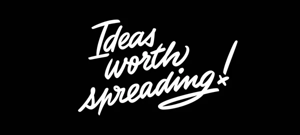
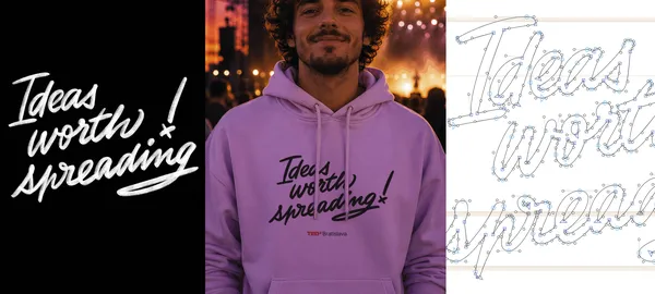
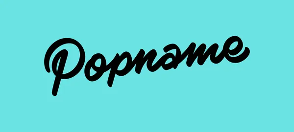
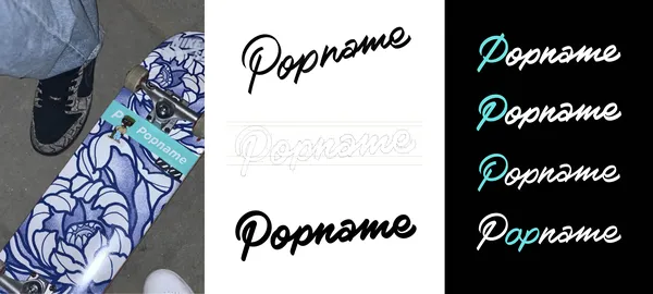
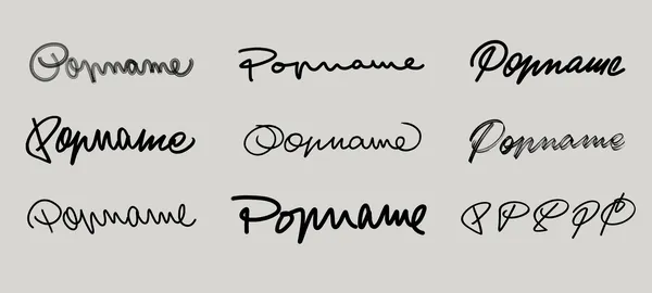
I sketched various freehand alternatives, aiming to capture a street-inspired character and energy through a single-stroke inscription. (However, the goal of keeping all letterforms clearly readable ultimately led me to disconnect the p and n.) The original drawing was created with a flat-tip marker, angled upward, with an oval skeleton for most glyphs. During digitization, I also rounded all terminals — I feel this makes the logo softer and therefore more approachable, while also ensuring it works well for embroidery and other merchandise applications. The final lettering is slightly bolder than the original drawing, which should help it perform better across fabric applications, prints, and other uses.
The final lettering has a subtler slant than the original sketch, as well as slightly tighter spacing. All glyphs connect (with a small cheat in the p–n connection), and several of them aim to feel swashy and fast — echoing skating energy — particularly the lowercase a, e, and the loop in the initial P.
I’m still unsure whether the final outcome carries enough skateboarding attitude or if it feels slightly too polished, but it’s definitely ready to become a font someday :)