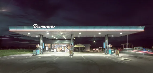
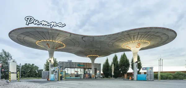
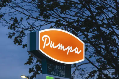
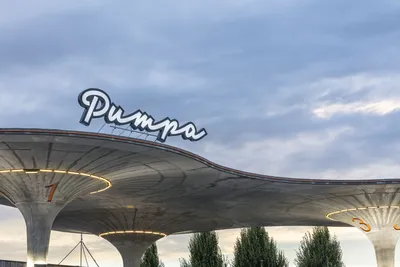
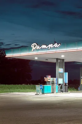
Lettering for Pumpa Gas Stations

We teamed up with Studio Milk to create a new corporate identity for the gas station chain Pumpa, with its first locations in Lozorno and Galanty, Slovakia. (More locations are on the way!)

The new branding was built around the idea of Pumpa as a good neighbor—local, friendly, and approachable, with a subtle nod to retro and socialist aesthetics. This vision led us to embrace hand-lettering over conventional grotesque fonts. We drew inspiration from Slovakia’s vintage sign-painted lettering and retro script styles from the 1960s to the 1990s.

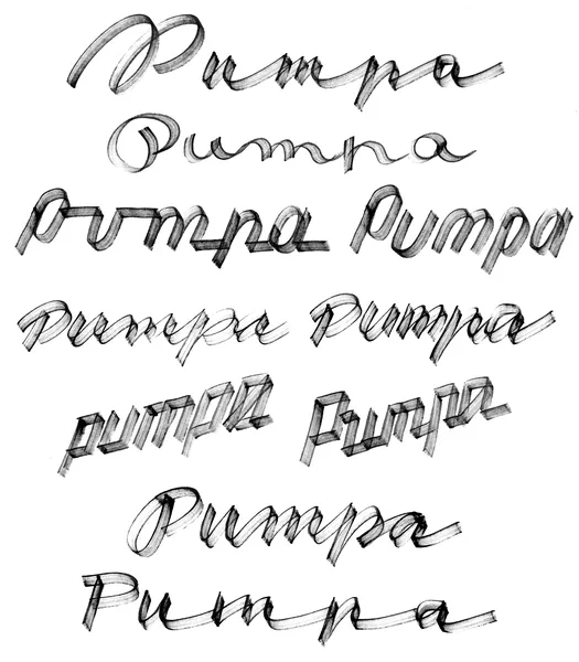
I crafted nearly 20 script variations and explored over 50 styles for the initial “P” before finalizing the design. The result is a monolinear lettering style with perpendicular stroke endings, echoing the simple architecture of the gas station. Each letter was meticulously adjusted, inclined, and connected, with careful attention to stroke balance for a cohesive and harmonious look.

Specification

  • Client
  • Lettering design

    Petra Dočekalová

  • Tools

    Flat alcohol markers

  • Agency
  • Designed, released

    2018, 2021

  • Photos
  • To complete Pumpa’s corporate identity, we added two signature color stripes: BloodOrange orange and Ozeanblau green—distinctive hues that make the branding instantly recognizable.

    Bonus

    Pumpa has become such an iconic spot that several Slovak rappers, including Majk Spirit & Grimaso and EGO feat. Ben Cristovao x Sima, chose it as the backdrop for their music videos. It even inspired the soap opera Pumpa produced by RSTV, using Pumpa’s lettering as a base for it’s logo. 

    We value your privacy

    This website uses cookies and other technologies to collect data such as your IP address, device data and browsing data which are necessary to proper website functioning or with your consent to analyse the traffic and improve our services. You can adjust or withdraw your consent at any time by visiting Cookie settings. To learn more, please visit our Cookie policy.