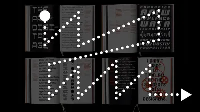
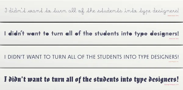
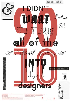
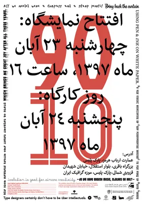
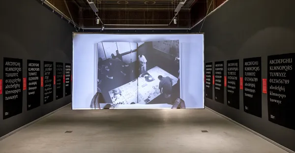
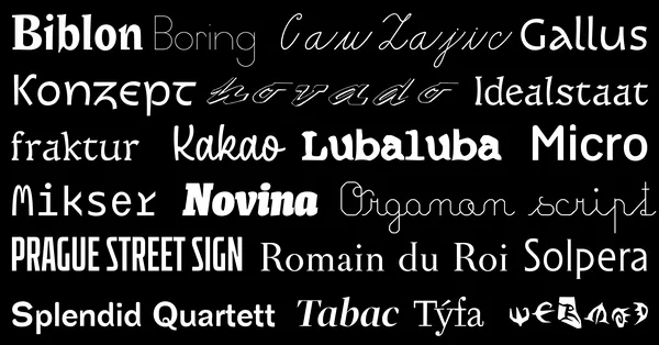
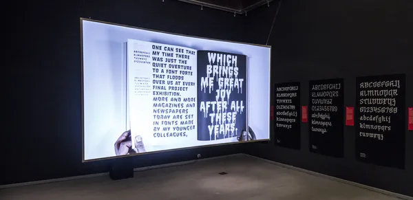
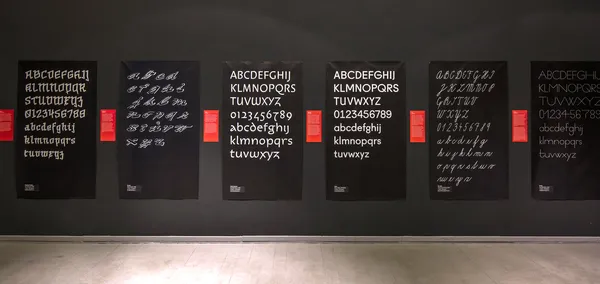
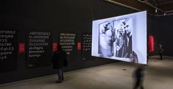
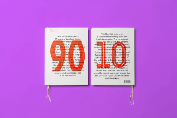
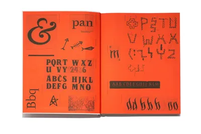
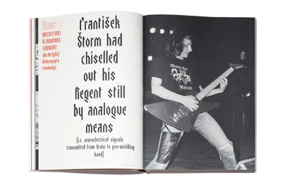
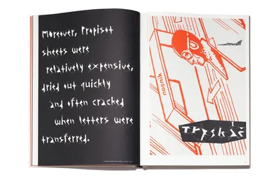
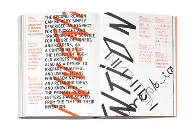
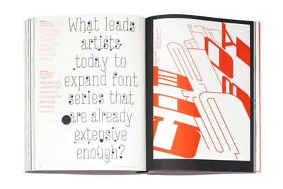
Czech Digitized Typefaces from 1990–2010

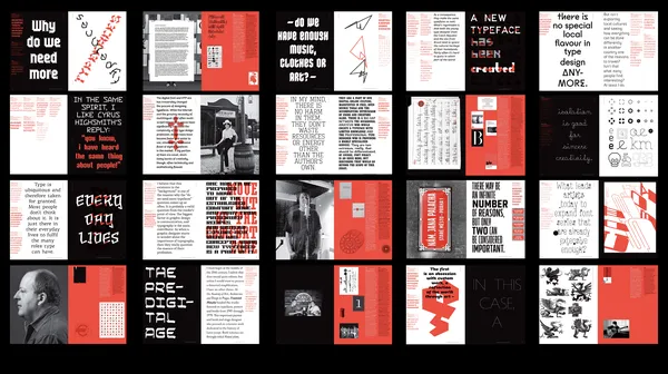
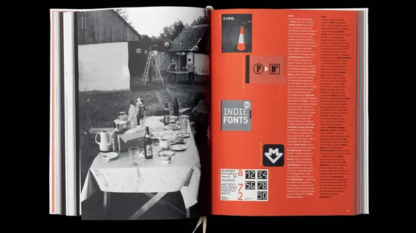
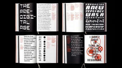
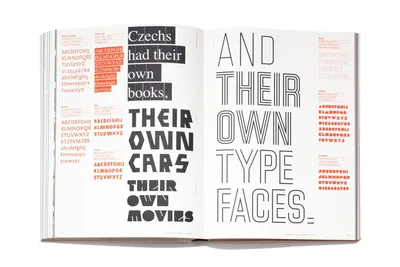
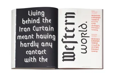
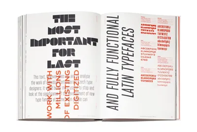
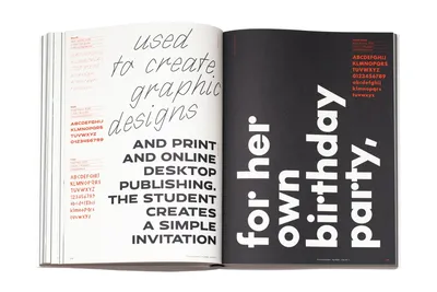
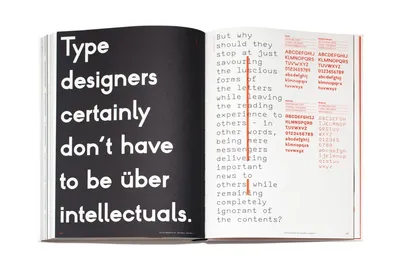
Publication TYPO9010 starts from 1990, a time when computers were starting to replace phototypesetting and copying letters by hand, and ending with 2010, when almost a dozen small type foundries were operating in the country. The book captures the most important moments at the oldest Czech type design studio (at the Academy of Arts, Architecture and Design in Prague) and recapitulates the most important milestones in the industry. Short texts by Czech and international typographers describing the atmosphere of the times are distributed throughout the book, which aims to present Czech type design and its digital beginnings in as much detail as possible while placing it into an international context. I’m super proud to be it’s editor in chief. 

Specification

  • Full name

    TYPO9010 / Czech Digitized Typefaces 1990–2010

  • Concept

    Tomáš Brousil

  • Editor

    Petra Dočekalová

  • Graphic design

    Zuzana Lednická, Radek Sidun

  • Texts

    Petr Babák, Filip Blažek, Veronika Burian, Karel Haloun, Ondřej Chorý, Bas Jacobs, Pavel Noga, Jan Solpera, František Štorm

  • Language

    English, Czech

  • Publisher
  • Published

    2015

  • ISBN

    978-80-906019-5-6

  • Pages

    288

  • Format

    220 × 300 mm

  • Paper

    115g Munken Print White 1,8

  • Print

    PB tisk, a. s. Příbram

  • Read more
  • Awards

    Most Beautiful Czech Books of 2015 #51 / Category Professional Literature / Gold

    Czech Grand Design / Graphic Designer of the year 2015 / Winner 

    ED Awards, European Design Awards, Bronze: Artistic Catalogue

    Communication Arts – Award o Excellence / Creative Arts 

    Design Observer 50 Books | 50 Covers / Leipzig 

    We chose to design a unique, playful layout for TYPO9010, breaking away from the conventions of similar publications. Zuzana Lednická drew inspiration from key Czech typography milestones, adopting the format of Muzika’s Beautiful Typefaces and channeling Hlavsa’s creative playfulness from Typographia. Her bold idea was to use only the featured typefaces throughout the entire book, transforming it into one cohesive and comprehensive type specimen. 

    The four distinct spines represent the generational contrasts not only among the contributing authors but also among the showcased typographers. The quote on the book’s spine could only belong to the father of Czech typography, Professor Jan Solpera.

    Bonus: Exhibition 

    This selection of twenty typefaces, which comprise about five percent of the 399 fonts presented in TYPO 9010, does not adhere to even one of the usual blueprints used to create similar selections, such as Solpera’s Classification of Latin Typefaces, a timeline, the number of times they’re mentioned in the book, or an attempt to present the one “most influential” typeface from each twenty-year period. We decided to select the ones we thought were the most distinctive, the ones that shifted the discipline of typeface design forward while seeking new possibilities for expression, and the ones that follow tradition in the classic meaning of the word. To put it simply, we wanted to provide the most diverse view of a field that currently enjoys increased interest

  • Full Name

    Hey Hare

  • Curators

    Tomáš Brousil, Petra Dočekalová, Karel Haloun, Zuzana Lednická, Radek Sidun

  • Gallery

    Gallery UM, Prague 2016, Campus Gallery, Košice, Slovakia 2016

  • We value your privacy

    This website uses cookies and other technologies to collect data such as your IP address, device data and browsing data which are necessary to proper website functioning or with your consent to analyse the traffic and improve our services. You can adjust or withdraw your consent at any time by visiting Cookie settings. To learn more, please visit our Cookie policy.