The company was founded in 1969 by Doug Warbrick…
Technical information
I developed and named the script typeface Kakabus after my collaboration with Kamila Kučerová back in 2017. The design is based on the marker lettering created for her graphic design studio of the same name. Although I tried to rename it later, the name had already grown so deeply under my skin that I couldn’t come up with anything that felt more fitting for months.
For Kakabus font, the key characteristic oval stroke is defined by the round Centropen marker, whose tip is sharply terminated. Writing at a slight slant forms an oval with one sharp point. It happens when writing at slight angles, where the marker's body is almost lying on the paper, and you write with the side of the tip. That way, the script can be written very quickly because the hand rests on a relatively large area of the paper and is confident. The stems are naturally bending when writing vertical strokes, according to the hand's anatomy. When writing horizontal strokes, the rotation of the hand at 90° makes the stems a little darker than the vertical ones. A characteristic sharp bend is produced at the corners and eyes when writing rounded strokes.
Kakabus is a script typeface that has been designed with user-friendliness in mind. It doesn't need any OpenType features (like hidden ligatures, forced contextual alternatives, stylistic sets or contextual substitutions) to connect seamlessly. It feels connected because the letters slightly overlap, making it easy to use. The cursive forms of the characters (e.g. r and s) have been replaced by their upright alternates, further enhancing the font's readability. The only exceptions in the features are fake small capitals, which you can use to set texts in all capitals.
PS. The term “kakabus“ is used in Czech to describe someone who is constantly grumpy and obnoxious. Neither characteristic fits the mood in which I created the typeface, but I loved the paradox!
Specification
-
Full Name:PD Kakabus
-
Styles:1 – Regular
-
Variable font:Not available
-
Type design:Petra Dočekalová
-
Designed:2017
-
Released:September 2025
-
Classification:Script, Brush, Casual
-
Number of glyphs:690
-
Font mastering:Renegade Fonts, Petra-D
-
Specimen Design:Marius Corradini
-
Text:Petra Dočekalová
Glyph
UTF-8: U+0041
Letters uppercase
A
0041
Á
00C1
Ă
0102
Ǎ
01CD
Â
00C2
Ä
00C4
Ạ
1EA0
À
00C0
Ā
0100
Ą
0104
Å
00C5
Ã
00C3
Æ
00C6
Ǽ
01FC
Ǣ
01E2
B
0042
C
0043
Ć
0106
Č
010C
Ç
00C7
Ĉ
0108
Ċ
010A
D
0044
Ď
010E
Đ
0110
Ð
00D0
E
0045
É
00C9
Ĕ
0114
Ě
011A
Ê
00CA
Ë
00CB
Ė
0116
Ẹ
1EB8
È
00C8
Ē
0112
Ę
0118
Ẽ
1EBC
Ə
018F
F
0046
G
0047
Ğ
011E
Ĝ
011C
Ģ
0122
Ġ
0120
Ḡ
1E20
H
0048
Ħ
0126
Ĥ
0124
I
0049
IJ
0132
Í
00CD
Ĭ
012C
Ǐ
01CF
Î
00CE
Ï
00CF
İ
0130
Ị
1ECA
Ì
00CC
Ī
012A
Į
012E
Ĩ
0128
J
004A
Ĵ
0134
K
004B
Ķ
0136
L
004C
Ĺ
0139
Ľ
013D
Ļ
013B
Ŀ
013F
Ł
0141
M
004D
N
004E
Ń
0143
Ň
0147
Ņ
0145
Ṇ
1E46
Ñ
00D1
Ŋ
014A
O
004F
Ó
00D3
Ŏ
014E
Ǒ
01D1
Ô
00D4
Ö
00D6
Ọ
1ECC
Ò
00D2
Ő
0150
Ō
014C
Ø
00D8
Ǿ
01FE
Õ
00D5
Œ
0152
P
0050
Þ
00DE
Q
0051
R
0052
Ŕ
0154
Ř
0158
Ŗ
0156
S
0053
Ś
015A
Š
0160
Ş
015E
Ŝ
015C
Ș
0218
Ṣ
1E62
ẞ
1E9E
T
0054
Ŧ
0166
Ť
0164
Ţ
0162
Ț
021A
U
0055
Ú
00DA
Ŭ
016C
Ǔ
01D3
Û
00DB
Ü
00DC
Ụ
1EE4
Ù
00D9
Ű
0170
Ū
016A
Ų
0172
Ů
016E
Ũ
0168
V
0056
W
0057
Ẃ
1E82
Ŵ
0174
Ẅ
1E84
Ẁ
1E80
X
0058
Y
0059
Ý
00DD
Ŷ
0176
Ÿ
0178
Ỵ
1EF4
Ỳ
1EF2
Ȳ
0232
Ỹ
1EF8
Z
005A
Ź
0179
Ž
017D
Ż
017B
Δ
0394
Ω
03A9
Ω
2126
Letters lowercase
a
0061
á
00E1
ă
0103
ǎ
01CE
â
00E2
ä
00E4
ạ
1EA1
à
00E0
ā
0101
ą
0105
å
00E5
ã
00E3
æ
00E6
ǽ
01FD
ǣ
01E3
b
0062
c
0063
ć
0107
č
010D
ç
00E7
ĉ
0109
ċ
010B
d
0064
ď
010F
đ
0111
ð
00F0
e
0065
é
00E9
ĕ
0115
ě
011B
ê
00EA
ë
00EB
ė
0117
ẹ
1EB9
è
00E8
ē
0113
ę
0119
ẽ
1EBD
ə
0259
f
0066
g
0067
ğ
011F
ĝ
011D
ģ
0123
ġ
0121
ḡ
1E21
h
0068
ħ
0127
ĥ
0125
i
0069
ı
0131
í
00ED
ĭ
012D
ǐ
01D0
î
00EE
ï
00EF
ị
1ECB
ì
00EC
ī
012B
į
012F
ĩ
0129
ij
0133
j
006A
ȷ
0237
ĵ
0135
k
006B
ķ
0137
ĸ
0138
l
006C
ĺ
013A
ľ
013E
ļ
013C
ŀ
0140
ł
0142
m
006D
n
006E
ń
0144
ʼn
0149
ň
0148
ņ
0146
ṇ
1E47
ñ
00F1
ŋ
014B
o
006F
ó
00F3
ŏ
014F
ǒ
01D2
ô
00F4
ö
00F6
ọ
1ECD
ò
00F2
ő
0151
ō
014D
ø
00F8
ǿ
01FF
õ
00F5
œ
0153
p
0070
þ
00FE
q
0071
r
0072
ŕ
0155
ř
0159
ŗ
0157
s
0073
ś
015B
š
0161
ş
015F
ŝ
015D
ș
0219
ṣ
1E63
ß
00DF
t
0074
ŧ
0167
ť
0165
ţ
0163
ț
021B
u
0075
ú
00FA
ŭ
016D
ǔ
01D4
û
00FB
ü
00FC
ụ
1EE5
ù
00F9
ű
0171
ū
016B
ų
0173
ů
016F
ũ
0169
v
0076
w
0077
ẃ
1E83
ŵ
0175
ẅ
1E85
ẁ
1E81
x
0078
y
0079
ý
00FD
ŷ
0177
ÿ
00FF
ỵ
1EF5
ỳ
1EF3
ȳ
0233
ỹ
1EF9
z
007A
ź
017A
ž
017E
ż
017C
μ
03BC
π
03C0
ƒ
0192
µ
00B5
Numbers
0
0030
1
0031
2
0032
3
0033
4
0034
5
0035
6
0036
7
0037
8
0038
9
0039
½
00BD
¼
00BC
¾
00BE
¹
00B9
²
00B2
³
00B3
⁴
2074
⁹
2079
Marks
̈
0308
̇
0307
̀
0300
́
0301
̋
030B
̂
0302
̌
030C
̆
0306
̊
030A
̃
0303
̄
0304
̒
0312
̣
0323
̦
0326
̧
0327
̨
0328
Punctuation
.
002E
,
002C
:
003A
;
003B
…
2026
!
0021
¡
00A1
?
003F
¿
00BF
·
00B7
•
2022
*
002A
#
0023
/
002F
\
005C
-
002D
–
2013
—
2014
‑
2011
_
005F
(
0028
)
0029
{
007B
}
007D
[
005B
]
005D
‚
201A
„
201E
“
201C
”
201D
‘
2018
’
2019
«
00AB
»
00BB
‹
2039
›
203A
"
0022
'
0027
@
0040
&
0026
¶
00B6
§
00A7
†
2020
‡
2021
%
0025
‰
2030
Symbols
⁄
2044
©
00A9
®
00AE
℗
2117
™
2122
°
00B0
|
007C
¦
00A6
¢
00A2
¤
00A4
$
0024
€
20AC
£
00A3
₿
20BF
¥
00A5
+
002B
−
2212
×
00D7
÷
00F7
=
003D
≠
2260
>
003E
<
003C
≥
2265
≤
2264
±
00B1
≈
2248
¬
00AC
~
007E
^
005E
∞
221E
∫
222B
∆
2206
∏
220F
∑
2211
√
221A
∂
2202
↑
2191
↗
2197
→
2192
↘
2198
↓
2193
↙
2199
←
2190
↖
2196
◊
25CA
¨
00A8
˙
02D9
`
0060
´
00B4
˝
02DD
˘
02D8
˚
02DA
˜
02DC
¯
00AF
¸
00B8
˛
02DB
Others
ª
00AA
º
00BA
ˆ
02C6
ˇ
02C7
Opentype features
aalt
c2sc
calt
case
ccmp
dlig
frac
kern
liga
lnum
locl
mark
mkmk
onum
ordn
salt
smcp
ss01
ss02
sups
zero
Scripts
Latin
Language support
Afrikaans
Albanian
Basque
Bosnian
Breton
Catalan
Chamorro
Chichewa
Cornish
Croatian
Czech
Danish
Dutch
English
Esperanto
Estonian
Faroese
Finnish
French
Frisian
Galician
German
Greenlandic
Hawaiian
Hungarian
Icelandic
Indonesian
Italian
Kashubian
Kurdish (Latin)
Latvian
Lithuanian
Luxemburgis
Maltese
Māori
Norwegian (Bokmål)
Occitan
Polish
Portuguese
Rhaeto-Romanic
Romanian
Serbian (Latin)
Slovak
Slovene
Somali (Latin)
Spanish
Swedish
Tswana
Turkish
Turkmen
Welsh
Wolof
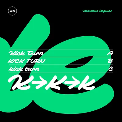
Kakabus Regular
Size: 125.0px
Line height: 90%
Don’t act like a $@#* Kakabus!
Kakabus Regular
Size: 64.0px
Line height: 110%
Kakabus is a script that has been designed with user-friendliness in mind. It doesn't need any features to connect seamlessly. It feels connected because the letters slightly overlap.
Kakabus Regular
Size: 24.0px
Line height: 120%
A key characteristic oval stroke is defined by the round marker, whose tip is sharply terminated. Writing at a slight slant forms an oval with one sharp point. It happens when writing at slight angles, where the marker's body is almost lying on the paper, and you write with the side of the tip. That way, the script can be written very quickly because the hand rests on a relatively large area of the paper
and is confident. The stems are naturally bending when writing vertical strokes, according to the hand's anatomy. When writing horizontal strokes, the rotation of the hand at 90° makes the stems a little darker than the vertical ones. A characteristic sharp bend is produced at the corners and eyes when writing rounded strokes.
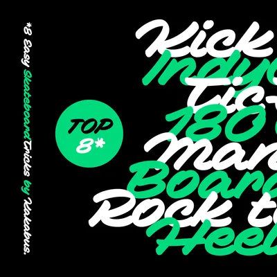
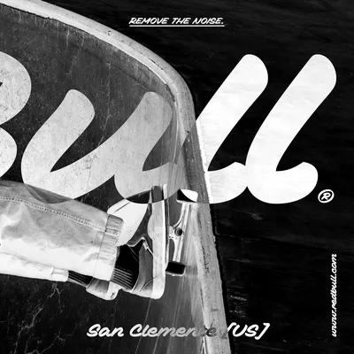
Raphael
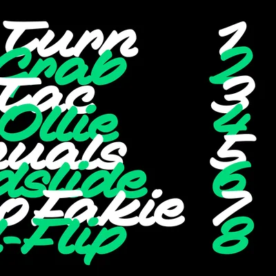
Red Bull skateboarding captures the energy and passion of the global skate scene.
ÁBČDEFGHIJKŁMNÕPQRSTŮVWXYŽ
âbçdéfghijklmńopqrstuvwxÿz
#0123456789&*
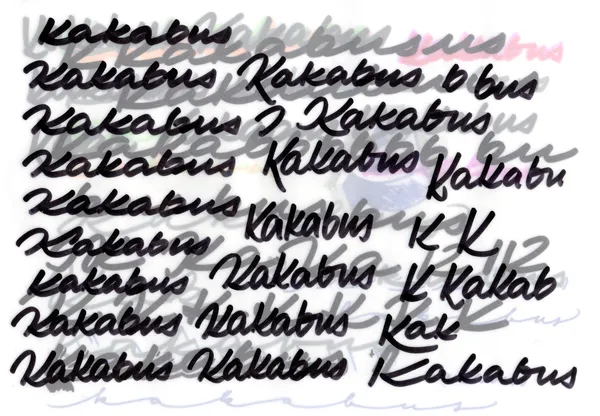
Some of the original sketches with Centropen marker, 2017
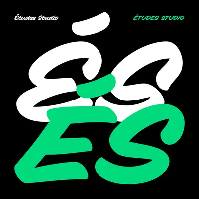
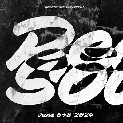
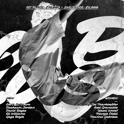
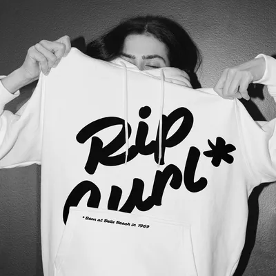
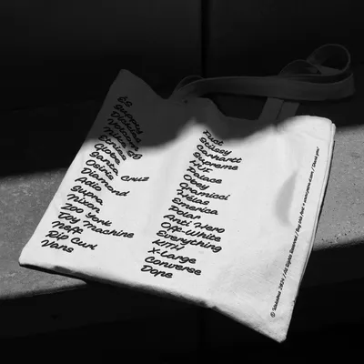
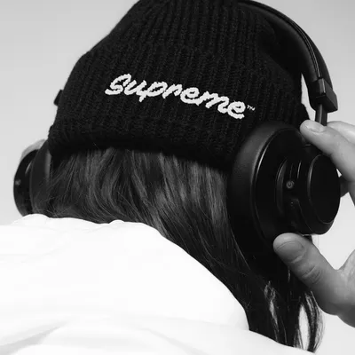
Font in Use

There were two versions of the final lettering, and the one with extended characters was chosen in 2017.
