Are You Ready for a New Hair Style?

Technical information
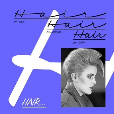
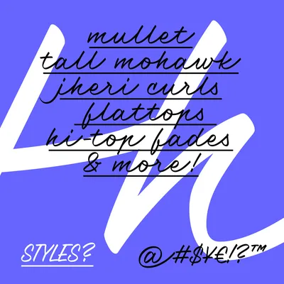
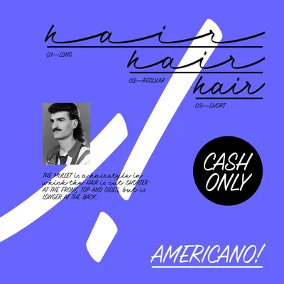
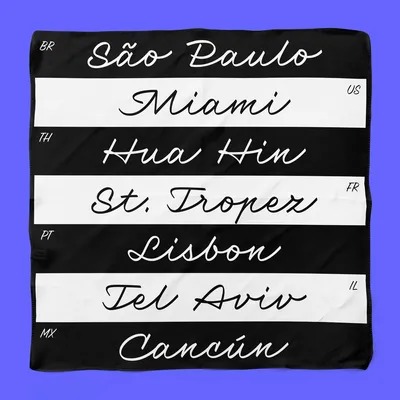
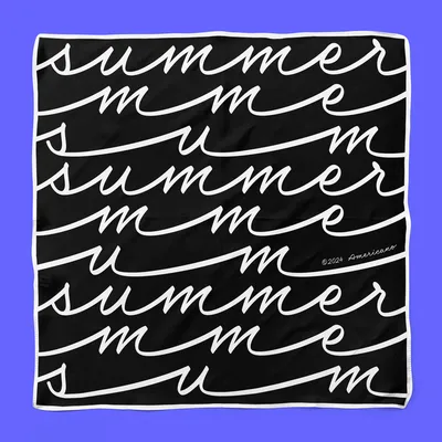
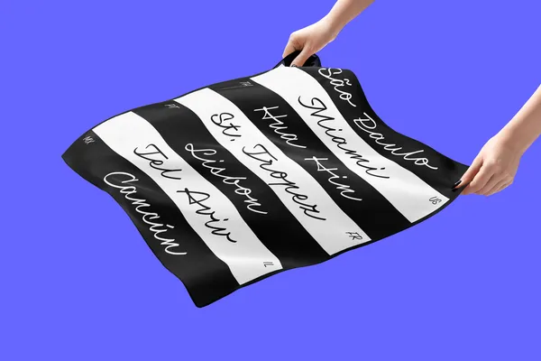
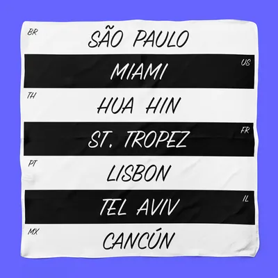
Americano is my first variable font. I created it’s hand-out as part of my master's thesis at UMPRUM (2016). It is a connected script based on the Czech cursive script called Pentlovka. The Pentlovka’s elasticity is based on the logic in sign painting, where the sign painter had to choose the proper spacing between letters according to the length of the signboard so that the letters would fit evenly into the designated area. Connecting strokes then serve more as an ornament. Americano is like a hybrid – it has a flowing effect, but its rhythm and regular connection are solid. Here, the smooth connections are made using the necessary initial, medial, isolated, and final glyph forms. The variable axis allows designers to choose the specific length of the connections between the glyphs, as the format requires. The variability can be helpful for various book spines, window displays or patterns, for example.
The shape of the lowercase letters are keeping the regular rhythm and slant, while the shapes of the uppercase are full of swashes so that they look more like an initials. For typesetting in uppercase only, the typeface thus includes narrow small capitals. At first, I wrote the typeface with a mono-linear marker, but it wasn't until I used a flat marker that the script typeface took on the exact character. The only thing missing was a name derived from the long connecting strokes – as a drink you can sip for however long you want – as café americano! In the future, you can look forward to a version with differently shaped connecting strokes; but for the moment, it must come out of the drawer!
Specification
-
Full Name:PD Americano
-
Styles:3 – Short, Regular, Long
-
Variable font:Available
-
Type design:Petra Dočekalová
-
Designed:2016, in use from 2022
-
Released:September 2025
-
Classification:Script, Cursive, Display
-
Number of glyphs:805
-
Font mastering:Renegade Fonts, Petra-D
-
Specimen Design:Marius Corradini
-
Text:Petra Dočekalová
Glyph
UTF-8: U+0041
Letters uppercase
A
0041
Á
00C1
Ă
0102
Ǎ
01CD
Â
00C2
Ä
00C4
Ạ
1EA0
À
00C0
Ā
0100
Ą
0104
Å
00C5
Ã
00C3
Æ
00C6
Ǽ
01FC
Ǣ
01E2
B
0042
C
0043
Ć
0106
Č
010C
Ç
00C7
Ĉ
0108
Ċ
010A
D
0044
Ď
010E
Đ
0110
Ð
00D0
E
0045
É
00C9
Ĕ
0114
Ě
011A
Ê
00CA
Ë
00CB
Ė
0116
Ẹ
1EB8
È
00C8
Ē
0112
Ę
0118
Ẽ
1EBC
Ə
018F
F
0046
G
0047
Ğ
011E
Ĝ
011C
Ģ
0122
Ġ
0120
H
0048
Ħ
0126
Ĥ
0124
I
0049
IJ
0132
Í
00CD
Ĭ
012C
Ǐ
01CF
Î
00CE
Ï
00CF
İ
0130
Ị
1ECA
Ì
00CC
Ī
012A
Į
012E
Ĩ
0128
J
004A
Ĵ
0134
K
004B
Ķ
0136
L
004C
Ĺ
0139
Ľ
013D
Ļ
013B
Ŀ
013F
Ł
0141
M
004D
N
004E
Ń
0143
Ň
0147
Ņ
0145
Ṇ
1E46
Ñ
00D1
Ŋ
014A
O
004F
Ó
00D3
Ŏ
014E
Ǒ
01D1
Ô
00D4
Ö
00D6
Ọ
1ECC
Ò
00D2
Ő
0150
Ō
014C
Ø
00D8
Ǿ
01FE
Õ
00D5
Œ
0152
P
0050
Þ
00DE
Q
0051
R
0052
Ŕ
0154
Ř
0158
Ŗ
0156
S
0053
Ś
015A
Š
0160
Ş
015E
Ŝ
015C
Ș
0218
Ṣ
1E62
ẞ
1E9E
T
0054
Ŧ
0166
Ť
0164
Ţ
0162
Ț
021A
U
0055
Ú
00DA
Ŭ
016C
Ǔ
01D3
Û
00DB
Ü
00DC
Ụ
1EE4
Ù
00D9
Ű
0170
Ū
016A
Ų
0172
Ů
016E
Ũ
0168
V
0056
W
0057
Ẃ
1E82
Ŵ
0174
Ẅ
1E84
Ẁ
1E80
X
0058
Y
0059
Ý
00DD
Ŷ
0176
Ÿ
0178
Ỵ
1EF4
Ỳ
1EF2
Ȳ
0232
Ỹ
1EF8
Z
005A
Ź
0179
Ž
017D
Ż
017B
Δ
0394
Ω
03A9
Ω
2126
Letters lowercase
a
0061
á
00E1
ă
0103
ǎ
01CE
â
00E2
ä
00E4
ạ
1EA1
à
00E0
ā
0101
ą
0105
å
00E5
ã
00E3
æ
00E6
ǽ
01FD
ǣ
01E3
b
0062
c
0063
ć
0107
č
010D
ç
00E7
ĉ
0109
ċ
010B
d
0064
ď
010F
đ
0111
ð
00F0
e
0065
é
00E9
ĕ
0115
ě
011B
ê
00EA
ë
00EB
ė
0117
ẹ
1EB9
è
00E8
ē
0113
ę
0119
ẽ
1EBD
ə
0259
f
0066
g
0067
ğ
011F
ĝ
011D
ģ
0123
ġ
0121
h
0068
ħ
0127
ĥ
0125
i
0069
ı
0131
í
00ED
ĭ
012D
ǐ
01D0
î
00EE
ï
00EF
ị
1ECB
ì
00EC
ī
012B
į
012F
ĩ
0129
ij
0133
j
006A
ȷ
0237
ĵ
0135
k
006B
ķ
0137
ĸ
0138
l
006C
ĺ
013A
ľ
013E
ļ
013C
ŀ
0140
ł
0142
m
006D
n
006E
ń
0144
ʼn
0149
ň
0148
ņ
0146
ṇ
1E47
ñ
00F1
ŋ
014B
o
006F
ó
00F3
ŏ
014F
ǒ
01D2
ô
00F4
ö
00F6
ọ
1ECD
ò
00F2
ő
0151
ō
014D
ø
00F8
ǿ
01FF
õ
00F5
œ
0153
p
0070
þ
00FE
q
0071
r
0072
ŕ
0155
ř
0159
ŗ
0157
s
0073
ś
015B
š
0161
ş
015F
ŝ
015D
ș
0219
ṣ
1E63
ß
00DF
t
0074
ŧ
0167
ť
0165
ţ
0163
ț
021B
u
0075
ú
00FA
ŭ
016D
ǔ
01D4
û
00FB
ü
00FC
ụ
1EE5
ù
00F9
ű
0171
ū
016B
ų
0173
ů
016F
ũ
0169
v
0076
w
0077
ẃ
1E83
ŵ
0175
ẅ
1E85
ẁ
1E81
x
0078
y
0079
ý
00FD
ŷ
0177
ÿ
00FF
ỵ
1EF5
ỳ
1EF3
ȳ
0233
ỹ
1EF9
z
007A
ź
017A
ž
017E
ż
017C
μ
03BC
π
03C0
ƒ
0192
µ
00B5
Numbers
0
0030
1
0031
2
0032
3
0033
4
0034
5
0035
6
0036
7
0037
8
0038
9
0039
½
00BD
¼
00BC
¾
00BE
¹
00B9
²
00B2
³
00B3
⁴
2074
⁹
2079
Marks
̈
0308
̇
0307
̀
0300
́
0301
̋
030B
̂
0302
̌
030C
̆
0306
̊
030A
̃
0303
̄
0304
̒
0312
̣
0323
̦
0326
̧
0327
̨
0328
Punctuation
.
002E
,
002C
:
003A
;
003B
…
2026
!
0021
¡
00A1
?
003F
¿
00BF
·
00B7
•
2022
*
002A
#
0023
/
002F
\
005C
-
002D
–
2013
—
2014
‑
2011
_
005F
(
0028
)
0029
{
007B
}
007D
[
005B
]
005D
‚
201A
„
201E
“
201C
”
201D
‘
2018
’
2019
«
00AB
»
00BB
‹
2039
›
203A
"
0022
'
0027
@
0040
&
0026
¶
00B6
§
00A7
†
2020
‡
2021
%
0025
‰
2030
Symbols
⁄
2044
©
00A9
®
00AE
℗
2117
™
2122
°
00B0
|
007C
¦
00A6
₿
20BF
¢
00A2
¤
00A4
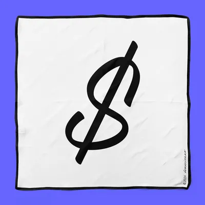
$
0024
€
20AC
£
00A3
¥
00A5
+
002B
−
2212
×
00D7
÷
00F7
=
003D
≠
2260
>
003E
<
003C
≥
2265
≤
2264
±
00B1
≈
2248
~
007E
¬
00AC
^
005E
∞
221E
∫
222B
∆
2206
∏
220F
∑
2211
√
221A
∂
2202
↑
2191
↗
2197
→
2192
↘
2198
↓
2193
↙
2199
←
2190
↖
2196
◊
25CA
¨
00A8
˙
02D9
`
0060
´
00B4
˝
02DD
˘
02D8
˚
02DA
˜
02DC
¯
00AF
¸
00B8
˛
02DB
Others
ª
00AA
º
00BA
ˆ
02C6
ˇ
02C7
Opentype features
aalt
c2sc
calt
case
ccmp
dlig
fina
frac
init
isol
kern
lnum
locl
mark
mkmk
onum
ordn
salt
smcp
sups
swsh
zero
Scripts
Latin
Language support
Afrikaans
Albanian
Basque
Bosnian
Breton
Catalan
Chamorro
Chichewa
Cornish
Croatian
Czech
Danish
Dutch
English
Esperanto
Estonian
Faroese
Finnish
French
Frisian
Galician
German
Greenlandic
Hawaiian
Hungarian
Icelandic
Indonesian
Italian
Kashubian
Kurdish (Latin)
Latvian
Lithuanian
Luxemburgis
Maltese
Māori
Norwegian (Bokmål)
Occitan
Polish
Portuguese
Rhaeto-Romanic
Romanian
Serbian (Latin)
Slovak
Slovene
Somali (Latin)
Spanish
Swedish
Tswana
Turkish
Turkmen
Welsh
Wolof
Wolf Cut
Americano Short
Size: 65.0px
Line height: 140%
Argentine Brussels Canada Damascus Ecuador France Greece Hanover Italy
Americano Short
Size: 40.0px
Line height: 120%
A BRIEF HISTORY OF THE MULLET: BUSINESS UP FRONT, PARTY IN THE BACK! THE MULLET, A HAIRSTYLE CHARACTERIZED BY SHORT HAIR AT THE FRONT AND SIDES AND LONGER HAIR AT THE BACK, HAS HAD A FASCINATING JOURNEY THROUGHOUT HISTORY. WHILE IT'S OFTEN ASSOCIATED WITH THE 1980S, THE MULLET'S ROOTS CAN BE TRACED BACK TO ANCIENT CIVILISATIONS. WHILE THE MULLET MAY HAVE FADED IN POPULARITY FOR A TIME, IT HAS EXPERIENCED A RESURGENCE IN RECENT YEARS. CELEBRITIES AND INFLUENCERS HAVE EMBRACED THE STYLE, GIVING IT A NEW LEASE ON LIFE. THE MULLET'S ENDURING APPEAL LIES IN ITS VERSATILITY AND ABILITY TO BE ADAPTED TO SUIT DIFFERENT STYLES AND PERSONALITIES. WHETHER YOU LOVE OR LOATHE THE MULLET, IT'S UNDENIABLE THAT THIS ICONIC HAIRSTYLE HAS LEFT AN INDELIBLE MARK ON THE WORLD OF FASHION AND CULTURE.
Americano Variable
Size: 26.0px
Line height: 120%
Americano is a connected script based on the Czech cursive script called Pentlovka. The elasticity is based on the traditional sign painting, where the sign painter had to choose the proper spacing between individual letters according to the length of the
signboard so that the letters would fit evenly into the designated area. Connecting strokes then serve more as an ornament. Americano is like a hybrid – it has a flowing effect, but its rhythm and regular connection are solid.
Americano Long
Size: 28.0px
Line height: 140%
The shape of the lowercase letters are keeping the regular rhythm and slant, while the shapes of the uppercase are full of swashes so that they look more like an initials.
Americano Regular
Size: 65.0px
Line height: 140%
Lima Madrid Nancy Ostend Prague Quebec Rome Sicily Tokio Uruguay
Americano Short
Size: 55.0px
Line height: 120%
FRENCH BOB
PIXIE CUT
BIXIE
SHAGGY BOB
BUZZ CUT
BUTTERFLY CUT
WOLF CUT
BLUNT LOB
OCTOPUS CUT
BLOWOUT
MERMAID
CURTAIN LAYERS
U-SHAPED CUT
GLASS HAIR
WATERFALL
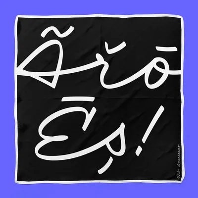
ÁBČDEFGHIJKŁMNÕPQRSTŮVWXYŽ
âbçdéfghijklmńopqrstuvwxÿz
#0123456789&*
Americano Long
Size: 65.0px
Line height: 140%
Victoria Warszawa Xaintrie Yokohama Zanzibar
Americano Short
Size: 26.0px
Line height: 120%
AMERICANO IS LIKE A HYBRID – IT HAS A FLOWING EFFECT, BUT ITS RHYTHM AND REGULAR CONNECTION ARE SOLID. HERE, THE SMOOTH CONNECTIONS ARE MADE USING THE NECESSARY INITIAL, MEDIAL, ISOLATED, AND FINAL GLYPH FORMS. THE VARIABLE AXIS ALLOWS DESIGNERS TO CHOOSE THE SPECIFIC LENGTH OF THE CONNECTIONS BETWEEN THE GLYPHS, AS THE FORMAT REQUIRES. THE VARIABILITY CAN BE HELPFUL FOR VARIOUS BOOK SPINES, WINDOW DISPLAYS OR PATTERNS.
THE SHAPE OF THE LOWERCASE LETTERS ARE KEEPING THE REGULAR RHYTHM AND SLANT, WHILE THE SHAPES OF THE UPPERCASE ARE FULL OF SWASHES SO THAT THEY LOOK MORE LIKE AN INITIALS. FOR TYPESETTING IN UPPERCASE ONLY, THE TYPEFACE THUS INCLUDES NARROW SMALL CAPITALS. AT FIRST, I WROTE THE TYPEFACE WITH A MONO-LINEAR MARKER, BUT IT WASN'T UNTIL I USED A FLAT MARKER THAT THE SCRIPT TYPEFACE TOOK ON THE EXACT CHARACTER.

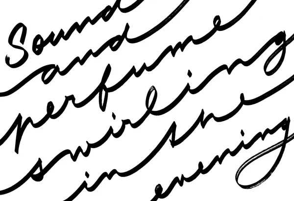
One of the original sketches with Centropen calligraphy marker (2016). Sketch with a flat marker gives the script different feel & rhythm (2020).