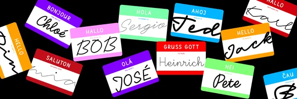
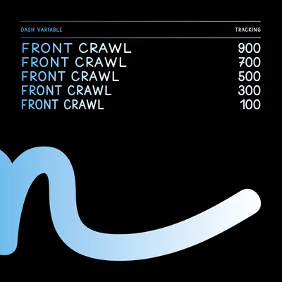
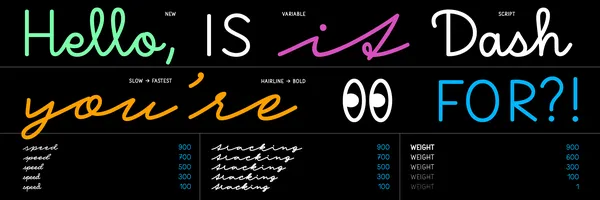
Dash, a typeface with different speeds and expressions

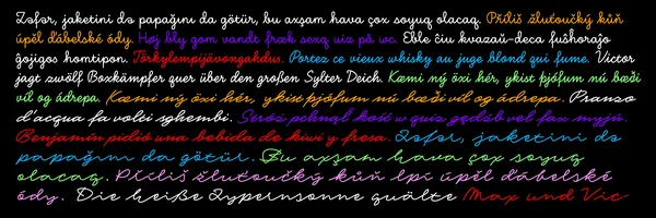
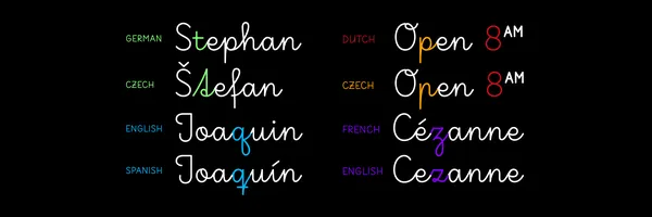
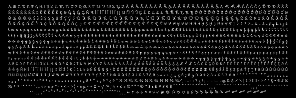
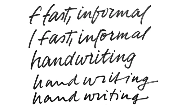
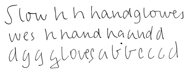
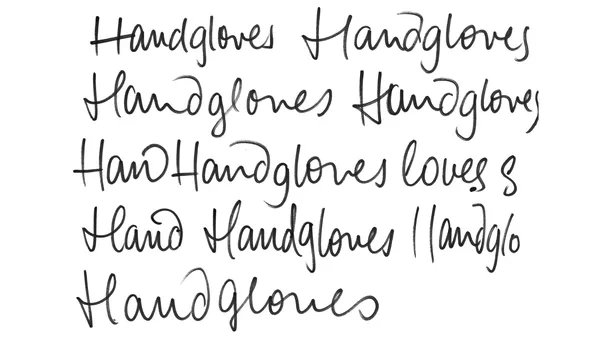
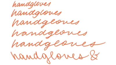
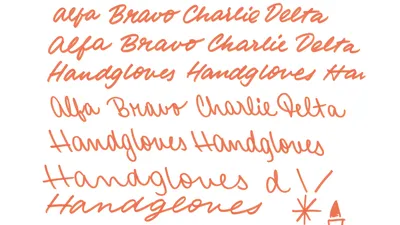
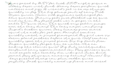
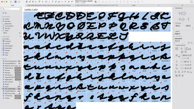
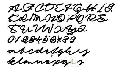
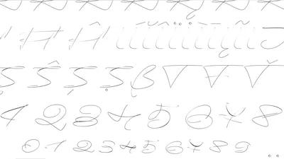
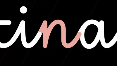
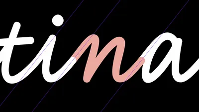
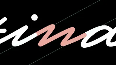
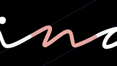
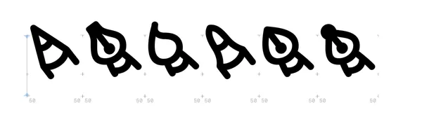
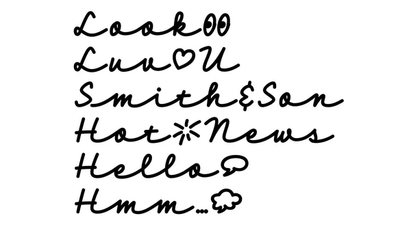
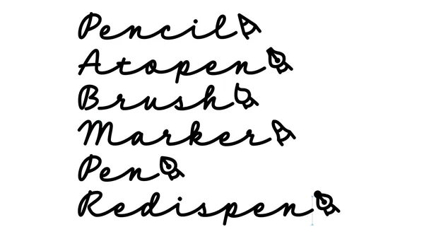
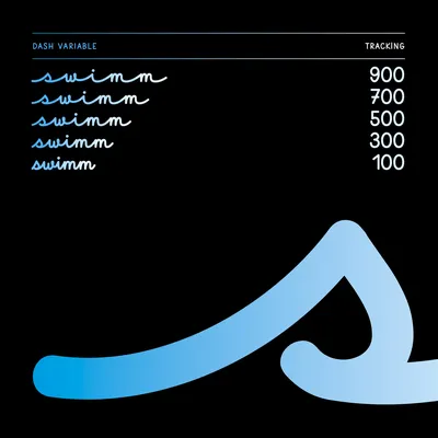
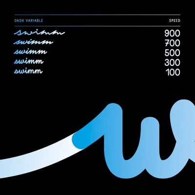
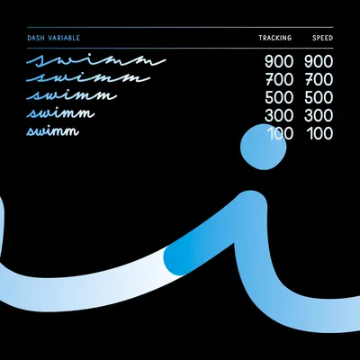
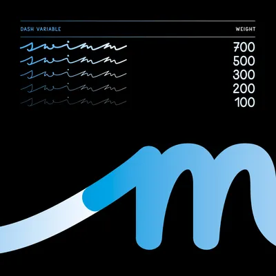
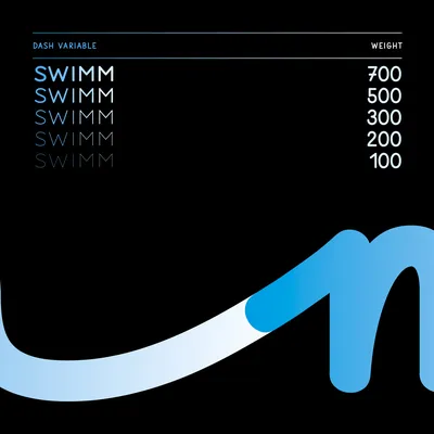
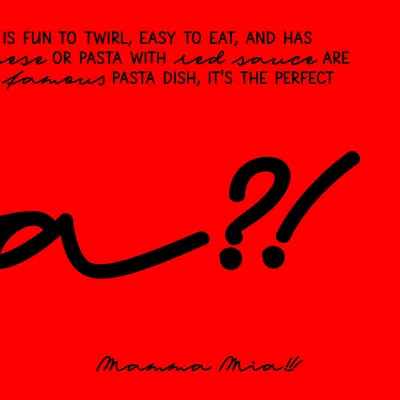
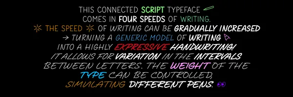
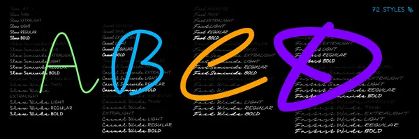
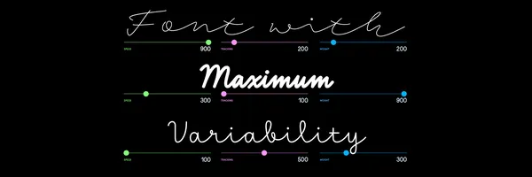
Dash is the ultimate handwriting typeface system with three variable axis that makes full use of variable expression. It is a connected script typeface that comes in four speeds of writing. Dash emulates how handwriting evolves over time into a personal expression of an individual. For the user, this means that the speed of writing can gradually be increased, turning a generic model of writing into a highly distinct and expressive kind of handwriting, whereby the letters are stripped down to their essential forms. Dash also allows for variation in the intervals between letters, and this too can be changed by the user. Finally, as is expected from today’s fonts, the weight of the type can be controlled, simulating different writing pens.

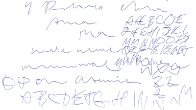
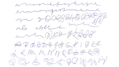
It was an extraordinary pleasure to collaborate on this complex project with Peter Biľak, founder of Typotheque and main figure behind entire project, a French researcher and writer Sébastien Morlighem who documented writing models and their evolution from the beginning of compulsory education in different countries, and a cognitive psychologist Héctor Mangas Afonso who created an in-depth study of local preferred forms of writing. 

Read the full article at Typotheque blog

Demo video of all three variable axis of Dash in Dinamo Font Gauntlet 

Specification

  • Full Name

    Dash

  • Masters

    (4) Slow, Casual, Fast, Fastest

  • Variable font

    Three axes: Speed, Tracking, Weight

  • Static Styles

    72

  • Client
  • Type design

    Petra Dočekalová

  • Collaboration
  • Font Mastering
  • Designed, released

    2023

  • Classification

    Brush, Script, Upright

  • Number of glyphs per style

    1163

  • Awards

    D&AD / The best of the year in advertising, design, craft, culture and impact at this year’s D&AD, TDC #70 / Certificate of Typography Excellence by NY Type Directors Club

  • Sketches

    Here’s some early sketches of Dash. I was trying to fit into Typotheque’s visuality, explore the variability of expressions, slants, junctions, terminals, connections and mainly speed, and somehow write in three to four different manuscripts, that would still look united and pretty variable. There are still many more styles, that could be developed just by using another writing tool or rhythm. 

    The Fatest style was inspired by asemic writing, which is a form of art that resembles writing but lacks a specific, conventional meaning or readable content. Personally I adore this style!

    Glitches and errors of interpolation and variable axis in Dash. 

    A secret behind of individual glyphs connections for each master: Slow, Casual, Fast, Fastest.

    In all 16 masters Dash comes with a variety of symbols and ornaments too.

    We value your privacy

    This website uses cookies and other technologies to collect data such as your IP address, device data and browsing data which are necessary to proper website functioning or with your consent to analyse the traffic and improve our services. You can adjust or withdraw your consent at any time by visiting Cookie settings. To learn more, please visit our Cookie policy.